See my paintings HERE
Art Notes Blog HERE
Painters Tip:
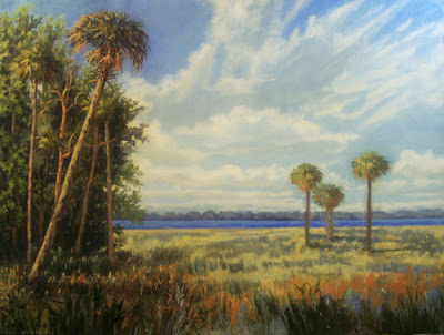
I want to dicuss atmospheric or aerial perspective, using the above painting I just completed. It is a good example I think.
Atmospheric perspective is an important aspect of landscape painting because it expresses spatial depth in your painting. Think of your painting as having three major planes, foreground, middleground and background. As objects diminish in the distance, their tones shapes and colors become more and more muted because there are minute particles of dust and other objects in the air between your eyes and the objects. That is why a landscape painting with all hard crisp detail looks amateurish. The painter is not taking atmospheric perspective into consideration.
Making decisions about what to subdue in color and how to push back objects for the viewer can be complicated and difficult. In this painting, I felt that I wanted the distant palms to be a balance for the strong, powerful values in the foreground. By giving fairly crisp detail to the foreground tree mass, I automatically set the scene for softer distant objects.
Early in the painting, I grayed down the three palms on the right too much. The depth change was too strong to read well. I came back in, giving the distant palms a bit more color and detail but kept them very soft. If you look closely, you will see that the three palms diminish in detail and color from the tallest, to the middle and finally to the back palm. It is not much but there is some difference in the three. The star of my production is the large palm which leans into the picture plane pulling the viewer into the scene. That powerful diagonal which is repeated in the cloud mass offsets the vertical and horizontal elements, creating interest.
I don't think the painting would have been nearly as effective without the strong sense of depth created by the atmospheric perspective. If I had given equal importance to all of the elements it would have been lacking in drama and intrigue.
My advice is that you must consider atmospheric elements carefully in certain compositions. Have a clear plan about the three planes in a painting, foreground,middleground and background. Deciding where you want the focus to be will help you overcome the habit and tendancy to make all areas of the painting equally important.
Thursday, January 31, 2008
Wednesday, January 23, 2008
Linda Blondheim Art Studio Landscapes Of The South
Palm Icon
5x7 inches
oil on panel
unframed
Purchase HERE
Art Notes Blog HERE
Painters Tip
Florida Palms
Palms are very popular in Florida and most patrons are attracted to them. The North Florida palm has a short fan shaped frond on stems. South Florida palms have longer fronds with narrow leaves that run up and down a single spine. Sabal Palm, like the painting above grow prolifically throughout the upper part of the state where I live. The colors vary, but the tend toward a nice olive green when you view them up close. Often he fronds turn brown at the tips, or a yellow/rust combination. The further down the trunk the go, the more likely they will be a tan or brown color. As the tree grows the lower fronds die off.
One of the problems I see with inexperienced palm painters is their tendency to make all of the fronds grow out of a single spot. In fact, they are growing out from the tree trunk in multiple angles and directions. The foreshortening makes the fronds directly in front of you look like a fan with no stem because you will not see the stem. the canopy also creates deep shadow on the trunk directly below the canopy. there are multiple tones from gray to brown on the trunks and some have quite a lot of texture while others will still retain the spines of broken off fronds.
They come in various sizes and heights as well. You will need to air them out in places so that they look three dimensional, with some spots of sky color showing through the canopy. When I demonstrate palm painting, I draw a little circle or half circle for the canopy and then proceed to fill it in with fronds. That is a good way to practice. Some canopies are smaller or wider or taller. They are never quite the same, so variety of shapes and colors will enhance your palm paintings.
Wednesday, January 16, 2008
Linda Blondheim Art Studio Landscapes Of The South
See my paintings HERE
Art Notes Blog: HERE
Painters Tip
Think about Light
Try This Exercise: You are going to consider the elements of light in a painting, trying to utilize and consider the elements listed below as you work.
I paint on location a lot and so I am always concerned with light in my paintings. They are high contrast and full of light. I think that is the consistency of my work, light and contrast.
Here are elements of light:
Light Source- Where is the light on an object coming from? It can be from several sources, including direct light from the sun as well as ambient light. It can be diffused or focused, bright or dim. It's position and intensity can effect the appearance and the mood of a painting.
Highlight- The brightest point of light on an object. It is found in the middle of the lightest area and is a reflection of the source of light. It can be hard or diffused and gives a visual clue to the texture of an object.
Light Mass- This is the area of an object which receives direct light. The light mass can have variation depending on the height and angle of the light source. For instance, the sun may be showing as back lit straight up, side lit and diffused by fog, etc.
Shadow Mass- This is the part of an object that is hidden from the sun and not lighted. It can be small areas or large, depending on the shape of an object.
Cast Shadow- This is the shadow which is a result of the object being in light. The sun or light source cannot reach the area which is closest to the object away from the light source. A cast shadow is darkest close to the object and then becomes lighter as it moves away, because filtered light is reaching it.
Reflected Light- This is dim light reflected into shadows from other surfaces.
Thursday, January 10, 2008
Blondheim Art Original Paintings
Garden Fun
2 1/2 x 3 1/2 inches
watercolor on cold press
unframed
11.00
.60 shipping
Purchase HERE
Painters Tip
Have A Plan
Composition in landscape painting is so vital to success. When you find the subject you like make a plan for the painting. Take pencil and paper and write down the following questions and answer them. Then you must use this plan to make your painting. After you have completed the painting check to see how closely you have followed your plan. If you did not follow the plan you need to justify the changes you made in your own mind. Get in the habit of doing this exercise regularly and your compositions will begin to improve.
Questions:
What is the main visual focus or element to the work?
Are there secondary focal points? What are they?
How will the viewer travel from the main to the secondary areas of focus?
Are there tertiary focal areas in the background which will draw the viewer's attention?
What is to be the mood or emotive content for the painting?
What is the light source? Direct or diffused light?
From where and how strong?
Once the main,secondary and tertiary focal areas have been identified,they can be positioned in the painting to optimize the elements of design and composition. Taking the time to write down the questions and answers and trying to make the painting follow them will help you to make good decisions instead of randomly painting. You can certainly add more questions as you do this exercise. I'm not suggesting that paintings should become formulaic, but a good guideline can help you to avoid many mistakes in design.
Thursday, January 03, 2008
Blondheim Art Original Paintings
Mail Art
Watercolor on cold press
See my paintings HERE
Art Notes Blog HERE
Happy 2008 Everyone!!!!!
Studio News
My monthly Open Studio Class resumes this Sunday January 6, 2008 2-6 PM I'm so looking forward to seeing my friends again. We took December off.
My new Plein Air Monthly Class begins this Saturday at 9 AM at Lake Alice, The University of Florida Campus. I hope to see my plein air painting friends there.
For more info on either class, email: lindablondheim12@hotmail.com
Painters Tip
I find myself with less free time these days so I will cut this blog down to once a week for awhile.
Today's Tip
I pride myself in being ready for everything, but I found that I have overlooked something in my marketing package. I am hosting a group at my studio in late January for a morning visit. They want to come and see my studio and learn a little something about my life as an artist. The coordinator wrote to me today and asked for the usual PR stuff, but she also asked me for images of my studio. Alas, I don't have any. I was caught off guard by this request, because my studio happens to be a mess at the moment. I was not planning to clean it up until Friday, in anticipation for my Monthly Open Studio Class this Sunday. Now I must scramble around today and take some images. I just never thought about including images of my studio in my standard marketing package.
The next time you are industrious and get your studio looking spiffy, pull out the camera and take a few good shots to keep as image files.
My marketing package will now include:
Current resume
Current Statement
Current Bio
1 gallery sheet of thumbnail images
1 full size image of a current painting for sale
1 image of myself
1 flattering image of my studio.
Subscribe to:
Posts (Atom)