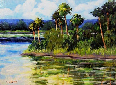
Myakka River
12x16 inches
mixed media on panel
gold frame
800.00
Purchase HERE
Painters Tip
If you have a topic you would like me to address, please email me at lindablondheim12@hotmail.com
Making a Painting Work
Sometimes what you think was a good subject or scene is not. This often times happens when you paint from photos. A perfectly lovely scene in a photo, will not translate well to paint and canvas. Such was the above painting in it's early stages. The original scene was very minimal, with no bushes or trees other than the palms, the jut of land and the distant shoreline. The reflections of the individual palms showed in the water in the lower left. It was a beautiful photo but ended up being quite blah on my panel.
After leaving it to sit for awhile, I decided it needed more bushes and growth, and a bit of something happening in the sky and water to make a go. That did the trick. It now looks nothing like my photo but who cares?
My job as a painter is to make it work, not to copy what I see. This is important for both studio and plein air work.
When you have a painting that is not working, you must be prepared to make changes in it. A bit of analysis is in order. Check for values and contrast. Is it blah because it has no value ranges? Check the composition. Is it too boring? Are there too many dead spaces? That was the case for my painting. What about color? Is it all too much the same? No changes in temperature. Are all the greens the same? Have you given it a sweet spot where the eye can go to see a bit of color or texture which is dominant? Have you used intervals in the painting to pull the eye along?
Remember that the scene you are painting may not have these elements. You as a good designer must create them.
I have students tell me all the time that their painting sucks and it's not working. I insist that they go back to it and think about why it is not working. I always tell them that they must be able to coherently list the things that are wrong before they can hope to make it work. If you don't know what is wrong, how can you fix it? Telling them what needs to be done will not teach them much. They need to learn to analise first.


5 comments:
Good advice, Linda. Also, there are some scenes that are not easily paintable--at least in a way that reflects the artist. For example, I am stretching myself to be much looser in paint application, brush work and color. When you're painting architecture, where perspective is important, subjects like these are a bit less paintable. Of course, almost everything is paintable, but finding a subject that fits your expression is important.
Interesting point Ed, I am wondering why everyone wants to make themselves paint looser and more abstract? Is that the latest thing in painting? I am hearing that all around these days.
I am seeing a lot of pretty sloppy, poorly executed paintings that suggest it must be the latest trend. Frankly, I don't much care for it. I don't equate sloppy work that looks like underpainting with good craftsmanship. Realizing here that I am in the minority. My work has always been fairly loose but mine looks positively refined next to some of what I have seen lately.
I'm often reminded that as artists our job is to interpret a scene to create a feeling, a sense of place. That usually takes manipulation on the canvas. Present circumstances demand that I paint primarily from photos. This advice is spot on and I've learned time and again that this early stage is fundamental to positive end results. Thanks for the specifics and reminders about learning to analyze.
Celeste,
Thanks so much. I'm so glad the post was timely for you.
Love,
Linda
Plein Air Florida: Didn't mean to suggest that a loose style is "better" than a tight style, although it does happen to be my personal preference.
I like the expressive quality of paint itself, the texture of very thick paint vs transparent washes.
Post a Comment